Dressing for Success: Your Home’s Guide to A+ Curb Appeal
Rhett Wilborn here. For more than thirty years, I’ve been in the business of transforming houses. From multi-million dollar rehabs to commercial properties, I’ve seen what works, what doesn’t, and what makes people stop their cars and stare. And let me tell you, nothing makes a bigger statement than your home’s siding color.
Choosing a siding color is one of the most permanent decisions a homeowner can make. It’s like getting a tattoo for your house, only it’s bigger, more expensive, and you can’t hide it under a long-sleeve shirt if you mess it up. The pressure is real. You’re not just picking a color; you’re choosing your home’s identity for the next 20 to 30 years. No pressure, right?
But it doesn’t have to be a shot in the dark. There’s a method to the madness, an art and a science to selecting a color that not only looks spectacular but also adds real, tangible value to your property. So grab a coffee, and let’s walk through this together. I’m going to give you the inside track, the stuff designers know that turns a simple house into a neighborhood landmark.

The #1 Mistake: Starting with a Paint Chip
Everyone does it. They go to the store, grab a handful of color samples they like, and tape them to their old, faded siding. This is the absolute wrong place to start. Looking at a tiny square of color in isolation is like trying to understand a novel by reading a single word.
The Golden Rule: Your palette is already 50% chosen for you.
You have to work with your “fixed elements”—the parts of your house that are expensive or impossible to change. The most dominant fixed element is your roof. Is it black, brown, gray, or weathered wood? A black roof gives you a ton of flexibility, but a brown roof will clash horribly with cool gray siding. Start by identifying the undertones in your roofing material. That’s your foundation.
Next, look at any brick or stone on your home. That masonry has a color story all its own, with flecks of tan, rust, gray, or cream. Your siding color must complement that story, not fight it. Even your driveway, walkways, and window frame colors play a role. Acknowledge these existing features first, and your potential color choices will narrow down from a thousand to a handful of perfect options.
Harmonizing with Your Home’s History and ‘Hood
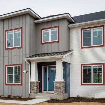
A house doesn’t exist in a vacuum. It has an architectural style and it has neighbors. A historic Victorian in Elgin can pull off a vibrant, multi-color scheme that would look completely out of place on a 1970s Ranch in Hoffman Estates. Respect your home’s character. Clean, modern lines call for crisp, simple palettes, while older homes with more ornate details can handle more complexity.
And then there are the neighbors. I’m not saying you have to match the house next door—please don’t! But you should aim for harmony. If you’re in a sea of earthy beiges and gentle grays, painting your house neon green isn’t just a bold choice; it’s a declaration of war. Your goal is to stand out for your impeccable taste, not for being the neighborhood sore thumb. If you’re in an HOA, this part isn’t optional, so check your covenants before you fall in love with a color.
The Science of Sight: Illinois Light & The Four-Season Factor
Here’s something most people never consider: color is a trick of the light. And here in Illinois, our light changes dramatically. The cool, weak, low-angled light of a January afternoon will make colors look grayer and more muted than the bright, warm, overhead sun of July. A color that looks like a friendly, warm beige on the sample chip can look like a drab, washed-out yellow in the dead of winter.
This is why you MUST test large samples. I’m talking 3-foot by 3-foot boards. Paint them and place them on different sides of your house (the shady north side and the sunny south side) and observe them at different times of day—morning, noon, and evening. How a color looks under the gray skies of an impending thunderstorm is just as important as how it looks on a perfect sunny day.
Also, consider the landscape. Your siding will look one way against the lush green of summer grass and trees, and completely different against the stark white of a snow-covered yard. Colors often appear darker and more saturated against snow.
The Designer’s Secret: The 60-30-10 Rule
Ready for a simple rule that will make you look like a design genius? It’s the 60-30-10 rule, and it’s the foundation of every great exterior color scheme. This is the core of any good siding color guide for Illinois.
- 60% is your dominant color: This is your main siding color. It’s the star of the show and covers the body of your house.
- 30% is your secondary color: This is for things like gables, garage doors, or other large accent areas. It should complement the main color and add interest.
- 10% is your accent color: This is the “jewelry.” It’s for your front door, shutters, and sometimes trim. This is where you can be a bit bolder and inject personality.
This simple ratio ensures a balanced, intentional look. It keeps the design from becoming too busy or too boring. Pick three colors that work with your fixed elements, assign them a role in the 60-30-10 structure, and you’re virtually guaranteed a cohesive, professional-looking result.
Your Top Siding Questions Answered
1. How do I properly test a siding color before committing?
Never rely on a small chip. Get a sample pot of paint and apply it to a large board (at least 3×3 ft). View it on different sides of your house and at all times of day (morning, noon, cloudy, sunny) to see how the light affects it. This is the only way to know for sure.
2. Should my gutters and trim be the same color?
Often, yes. Matching your fascia trim and your gutters (like our GutterShutter system) creates a clean, crisp frame for your home. A popular strategy is to have the gutters match the trim, which is often a contrasting color like white or black, to make your home’s architecture pop.
3. What are the best siding colors for resale?
If you’re thinking about selling in the next 5-10 years, sticking with timeless crowd-pleasers is a smart financial move. The absolute best siding colors for resale are almost always neutrals. Think warm off-whites (“greige”), light to medium grays, and classic deep blues. They have broad appeal and allow new buyers to envision themselves in the home.
4. How does siding color affect my home’s temperature?
It absolutely does. Darker colors absorb more solar radiation, which can make your home slightly warmer and increase cooling costs in the summer. Lighter colors reflect more light and can help keep your home cooler. The effect is modest but measurable, especially when paired with high-performance, insulated siding.
5. Can you match a specific color I found somewhere else?
Yes. With modern siding products, especially engineered wood like LP SmartSide, the color possibilities are nearly endless. We can often get custom colors or find a near-perfect match from a manufacturer’s extensive palette to achieve the exact look you’ve fallen in love with.
The Material Matters: Durability Meets Design

The final piece of the puzzle is the siding material itself. You can have the most beautiful color in the world, but if it fades, chips, or peels in five years, you’ve wasted your money. This is why I’m a huge proponent of engineered wood siding, and specifically our InnoMAXX siding system built around LP SmartSide.
Unlike vinyl, which can fade and become brittle, or fiber cement, which can have issues with moisture and cracking, LP SmartSide is treated to the core to resist moisture, rot, and termites. But the key for our discussion today is color. Because it’s a stable wood composite, it holds paint exceptionally well. The LP SmartSide color options come in a huge array of pre-finished colors that are baked-on in a controlled factory environment. This finish is far more durable and fade-resistant than any paint job applied on-site.
Real-World Illinois Inspiration
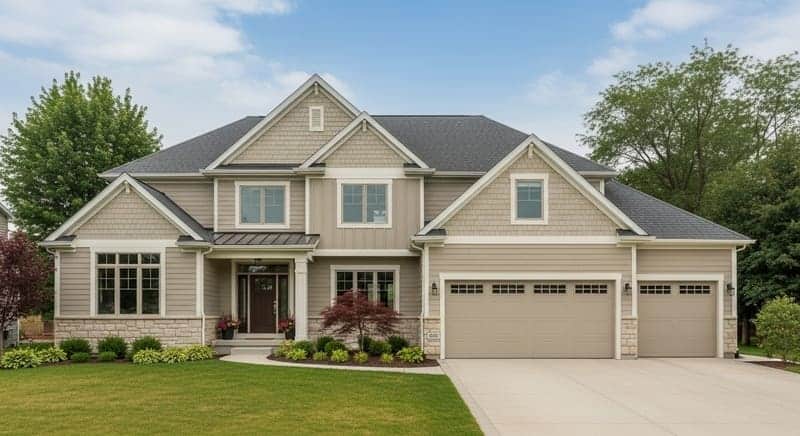
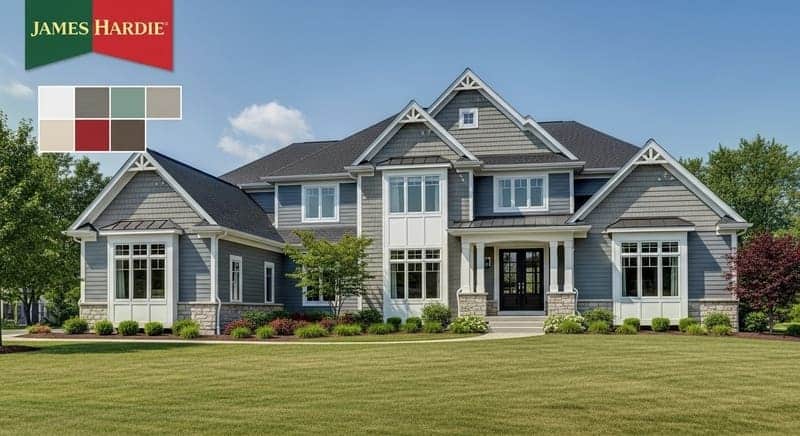
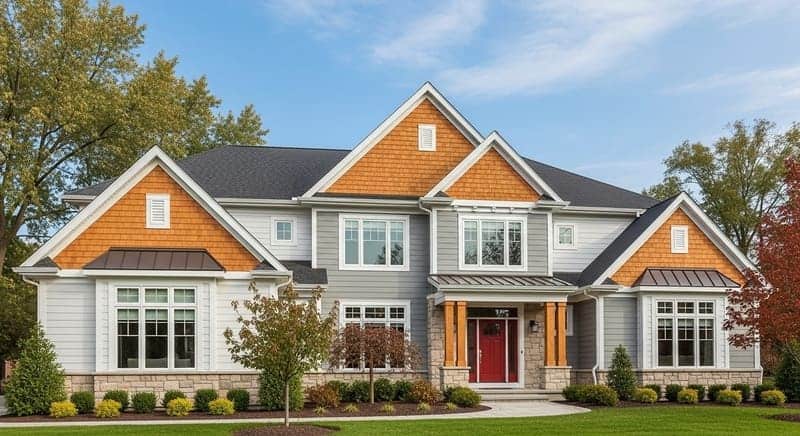
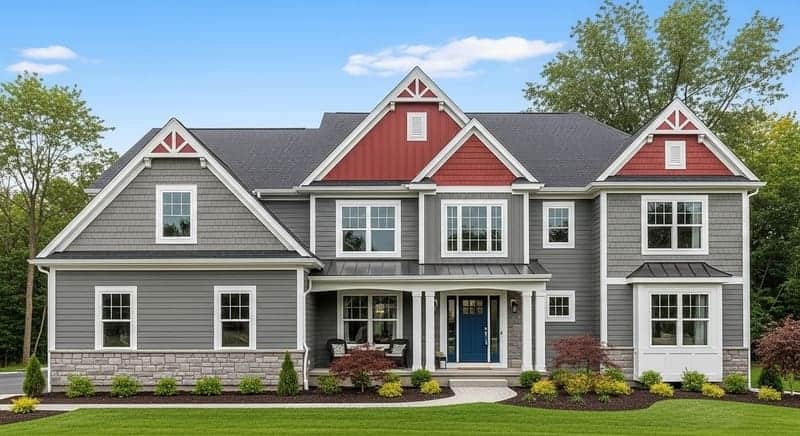
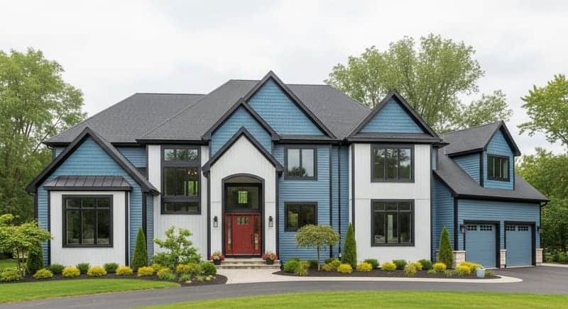
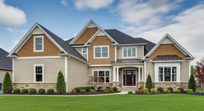
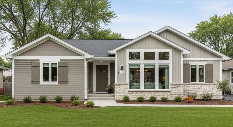
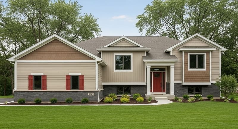
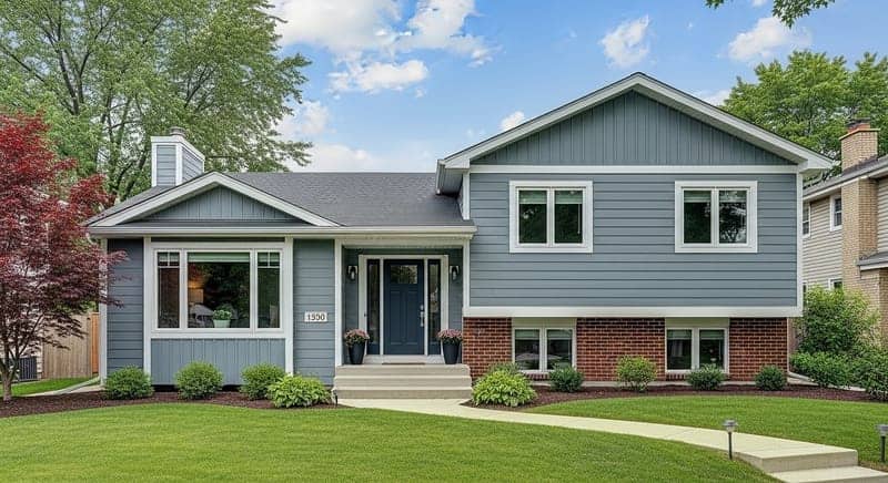
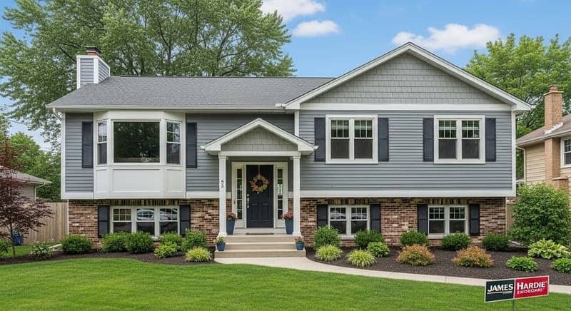
Talk is cheap. Let’s look at some real examples of how these principles come together on homes right here in our area. See how different colors and combinations create entirely different personalities.
Feeling Inspired? Or Maybe a Little Overwhelmed?
Choosing the right siding and color is a big deal, but you don’t have to do it alone. My team and I have the experience and design tools to help you visualize your choices and make a decision you’ll be thrilled with for years to come. Let’s make your home the best-dressed on the block.
Book Your Free Design ConsultationFor Further Information & Inspiration
For those who really want to geek out on color theory and design, here are a few authoritative resources I recommend:
- LP SmartSide® Siding Colors – Explore the official color collections and see how they look on different home styles.
- Sherwin-Williams: Color Theory – A great primer on the basics of the color wheel and how colors interact.
- Better Homes & Gardens: Exterior Color Schemes – A fantastic gallery for getting ideas about what’s possible with color, trim, and accents.
